From subtle updates to bold reimaginings, a successful logo redesign can revitalise a brand, enhancing its relevance, accessibility, and impact. We’ve gathered some standout examples of brands that have mastered the art of logo evolution—let’s dive into what makes them effective.
PayPal

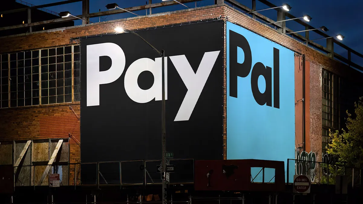
PayPal’s recent logo update is a prime example of subtlety at work. It enhances clarity while ensuring the design works seamlessly in digital environments. While staying true to its heritage, the update modernises the logo to better resonate with PayPal’s global audience.
What’s changed?
- Refined typography: The typeface is bolder, more legible, and perfect for small screens and quick views.
- Unified blue shades: PayPal’s blue palette has been harmonised for a fresh, trustworthy look across all platforms.
Why it works: By making minimal adjustments, PayPal has preserved its recognisability while giving the logo a modern twist, ensuring it remains relevant in today’s digital-first world.
Figma

Figma’s latest redesign goes beyond a logo update; it’s a full visual evolution. Moving away from simple geometry and static shapes, the new design embraces dynamic motion, a broader colour palette, and softer forms, reflecting the platform’s growth and its collaborative nature. This transformation marks Figma’s shift from a design tool to an ecosystem supporting developers, product managers, and teams.
What’s changed?
- Expanded colour palette: A broader range of dynamic shades that adapt easily across different contexts.
- Custom typefaces: Figma collaborated with Grilli Type to develop a set of custom typefaces, adding versatility and character.
- Integrated motion: Animations are woven into the design, guiding users through their creative process in an engaging way.
Why it works: Figma’s updated identity embodies its inclusive, creative spirit. With warmth, creativity, and motion, the logo feels both fresh and familiar, reflecting the brand’s roots while embracing its evolution.
Lloyds Bank

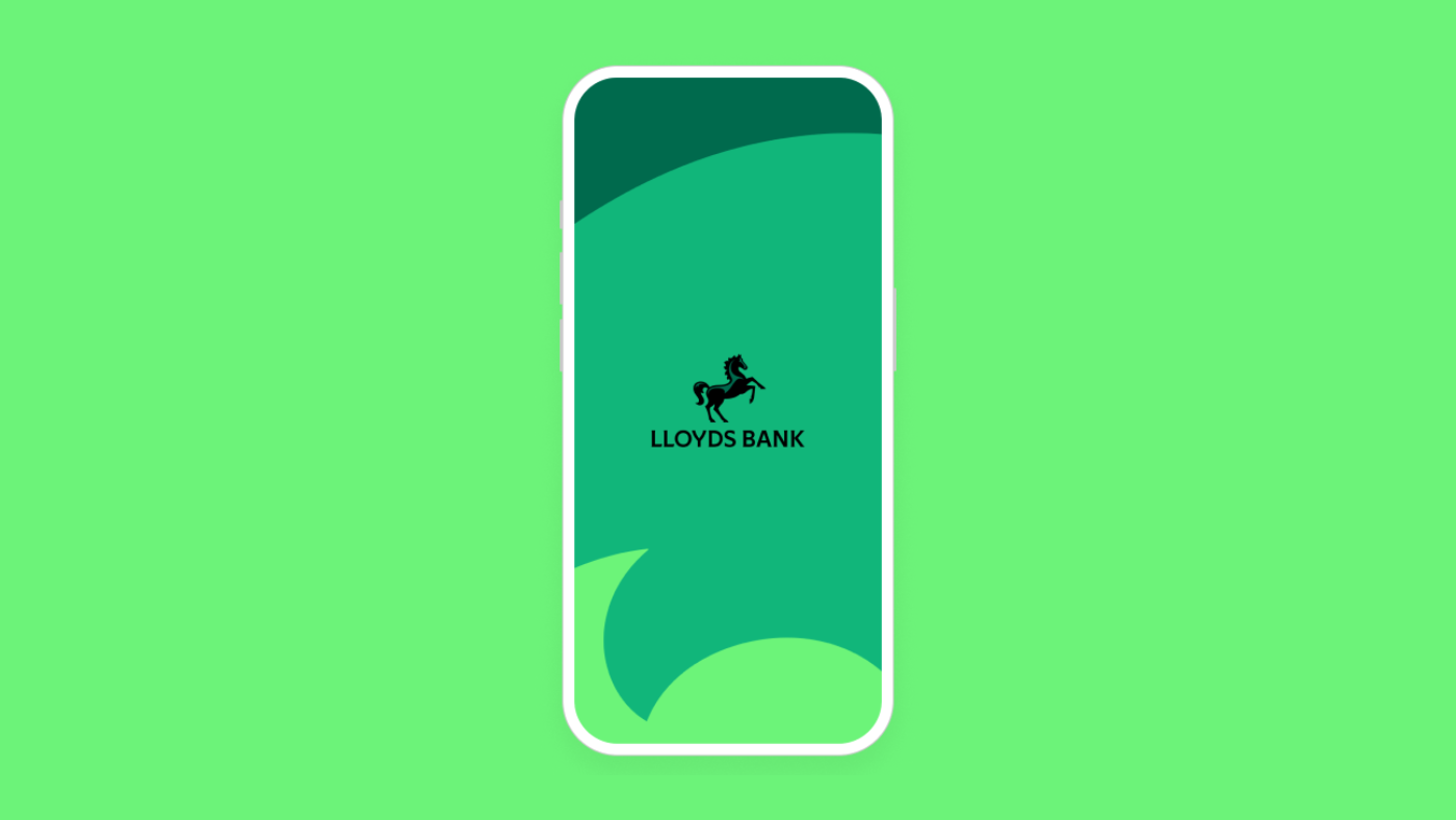
Lloyds Bank’s iconic black horse has stood the test of time. When it came to modernising the logo, they made subtle changes that respect tradition while giving it a sleek, contemporary look.
What’s changed?
- Refined horse illustration: The horse now has cleaner lines, maintaining its timeless quality while looking sharp on digital screens.
- Modernised typeface: A more contemporary font that retains the sense of reliability Lloyds is known for.
- Brightened colour palette: The green tones have been updated for a fresher, more inviting look.
Why it works: Lloyds demonstrates that evolution doesn’t have to mean drastic change. They’ve struck the perfect balance between respecting their legacy and modernising for the future.
Burger King

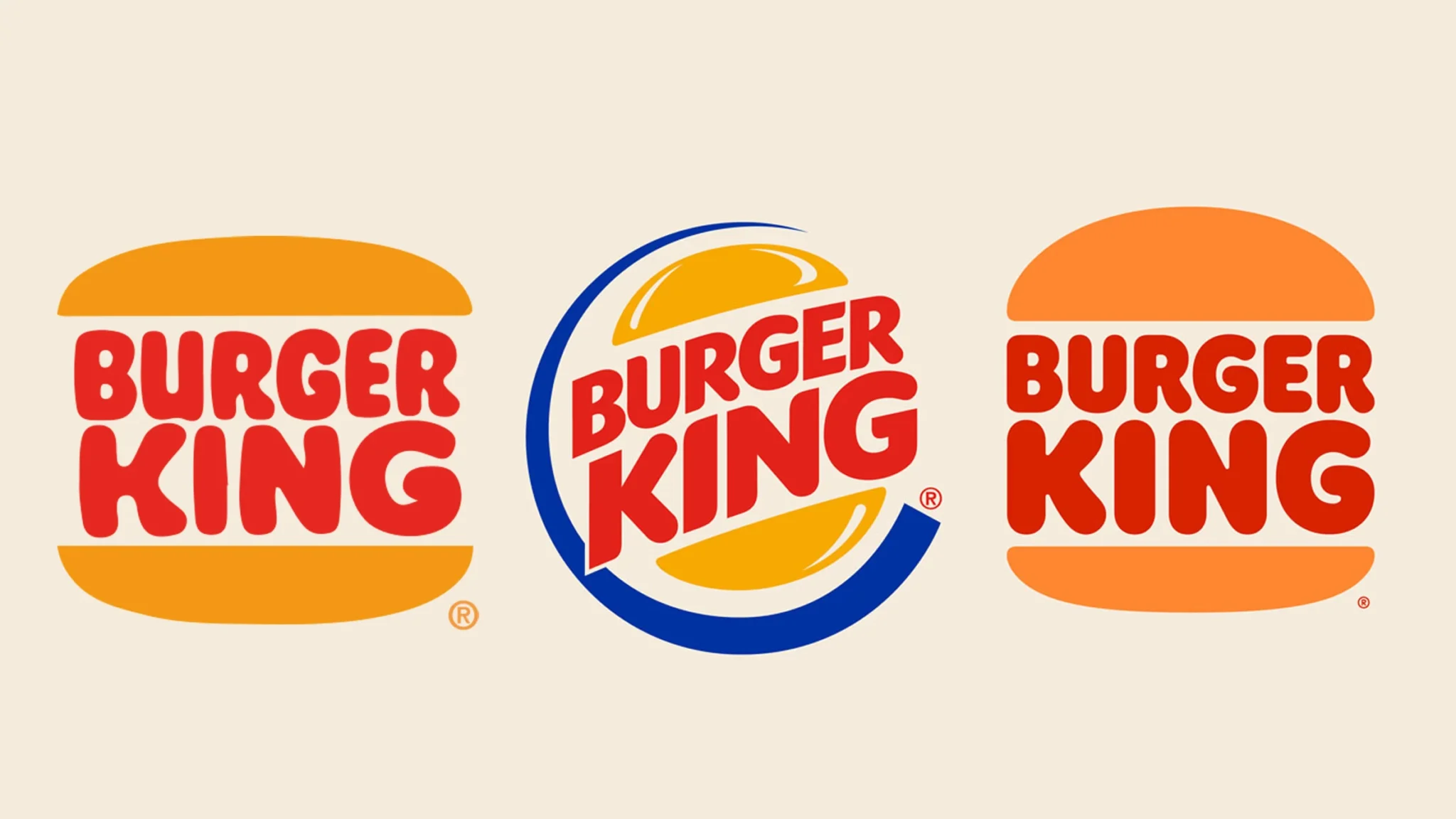
Burger King embraced retro vibes with their rebrand, revisiting their 1969 logo. By ditching the glossy, 3D elements of the early 2000s, they’ve returned to a flat, minimalist design that feels both nostalgic and contemporary.
What’s changed?
- Flat design: The logo now boasts a sleek, 2D style that combines classic and modern aesthetics.
- Playful typography: A bold, friendly typeface that feels approachable and in line with the fast-food brand’s personality.
- Warm colour scheme: The iconic red, yellow, and brown palette brings comfort and familiarity to the design.
Why it works: Burger King’s rebrand proves that sometimes, going back to your roots can create something fresh. Their design successfully merges nostalgia with modern trends.
Pringles

Pringles took a minimalist approach to their logo refresh. Their mascot, Mr. P, received a subtle makeover with a cleaner, more digital-friendly look. The result is sleek, modern, and still very much Pringles.
What’s changed?
- Simplified mascot: Mr. P is now more refined, making him look great across both packaging and digital platforms.
- Flat colours: The flat colour approach gives the logo a modern, crisp edge.
- Adaptable design: The updated look ensures Pringles remains recognisable on any screen, from mobile to print.
Why it works: Pringles has streamlined its design while keeping the brand’s playful spirit intact. This update makes the logo feel fresh and adaptable to the digital age.
Key Takeaways
These logo redesigns demonstrate powerful brand evolution:
- Subtle tweaks matter: Sometimes, refining what’s already there can have a huge impact. PayPal and Lloyds show how small changes can refresh a brand.
- Adapt for digital: In a digital-first world, logos must work across all platforms. PayPal and Pringles prove that simplifying can make logos more versatile.
- Stay true to your roots: Whether embracing nostalgia like Burger King or refreshing a classic like Lloyds, it’s important to stay authentic while evolving for your audience.
Ready to refresh your brand?
A well-executed logo redesign is an upgrade that keeps a brand’s identity intact while making it feel fresh and engaging. These examples show that thoughtful adjustments, nods to nostalgia, and modern spins can all effectively modernise a brand’s identity. Whether opting for a subtle refresh or a complete revamp, the key is balancing tradition with innovation—ensuring your brand feels at home in today’s fast-evolving digital world.

